Study notes
Load and clean data
# Load data from csv file
!wget https://raw.githubusercontent.com/MicrosoftDocs/mslearn-introduction-to-machine-learning/main/Data/ml-basics/grades.csv
df_students = pd.read_csv('grades.csv',delimiter=',',header='infer')
# Remove any rows with missing data
df_students = df_students.dropna(axis=0, how='any')
# Calculate who passed.
# Assuming 60 is the grade, all students with Grade >=60 get True, others False
passes = pd.Series(df_students['Grade'] >= 60)
# Add a new column Pass that contains passed value per every student, see above
df_students = pd.concat([df_students, passes.rename("Pass")], axis=1)
# dataframe
df_students
Result:
Name
Name
| # | Name | StudyHours | Grade | Pass |
|---|
| 0 | Dan | 10.00 | 50.0 | False |
|---|
| 1 | Joann | 11.50 | 50.0 | False |
|---|
| 2 | Pedro | 9.00 | 47.0 | False |
|---|
| 3 | Rosie | 16.00 | 97.0 | True |
|---|
| 4 | Ethan | 9.25 | 49.0 | False |
|---|
Visualise data with matplotlib
# Plots shown inline here
%matplotlib inline
from matplotlib import pyplot as plt
# set sizes for the box graph (no this - graph will be created as a square)
plt.figure(figsize=(12,5))#create bar chart
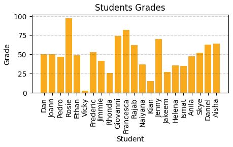
plt.bar(x=df_students.Name, height=df_students.Grade)
# Title
plt.title('Students Grades')
plt.xlabel('Student')
plt.ylabel('Grade')
# Show y labels on vertical
plt.xticks(rotation=90)
# Show grid
plt.grid(color="#cccccc, linestyle='--', linewidth=2, axis='y', alpha=0.7)
#display it
plt.show()

# Compute how many students pass and how many fails
rez =df_students.Pass.value_counts()
print(rez)
Result:
False 15
True 7
Name: Pass, dtype: int64
Keys (index)
False and
TrueThey will be used in legend for pie chart bellow.
Figure with two subplots
%matplotlib inline
fig, ax = plt.subplots(1,2, figsize=(10,4))
# Create bar chart plot
ax[0].bar(x=df_students.Name, height=df_students.Grade, color='green')
ax[0].set_title('Grades')
ax[0].set_xticklabels(df_students.Name, rotation=90)
# Create pie chart plot
pass_count = df_students['Pass'].value_counts()
# Above can be pass_count=df_students.Pass.value_counts() caount haw many Pass and Not Pass are
ax[1].pie(pass_count, labels=pass_count)
ax[1].set_title('Passing Count')
# Build a list where label name is the key from pass_count dataset and the explanation si the value.
ax[1].legend(pass_count.keys().tolist())
#Ad subtitle to figure (with 2 subplots)
fig.suptitle('Student Data')
#Show
fig.show()
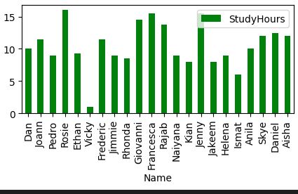
Pandas includes graphics capabilities.
# Automatic lables on y rotation, automatic legend generation
df_students.plot.bar(x='Name', y='StudyHours', color ='green', figsize=(5,2))
 Descriptive statistics and data distribution
Read this first.
Grouped frequency distributions (cristinabrata.com)Q: How are Grades values distributed across the dataset (sample),
not dataframe? Data distribution study unidimensional array in this case.
A: Create a histogram.
%matplotlib inline
from matplotlib import pyplot as plt
# Create data set
var_data = df_students.Grade
# Create and set figure size
fig = plt.figure(figsize=(5,2))
# Plot histogram
plt.hist(var_data)
# Text
plt.title('Data distribution')
plt.xlabel('Value')
plt.ylabel('Frequency')
fig.show()
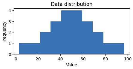
Looking to understand how values ae distributed, measure somehow to find the
measure of central tendency (midle of distributin / data)
- mean(simple average)
- median(value in the middle)
- mode(most common occurring value)
%matplotlib inline
from matplotlib import pyplot as plt
# Var to examine
var = df_students['Grade']
# Statistics
min_val = var.min()
max_val = var.max()
mean_val = var.mean()
med_val = var.median()
mod_val = var.mode()[0]
print('Minimum:{:.2f}Mean:{:.2f}Median:{:.2f}Mode:{:.2f}Maximum:{:.2f}'.format(min_val, mean_val, med_val, mod_val, max_val))
# Set figure
fig = plt.figure(figsize=(5,2))
# Add lines
plt.axvline(x=min_val, color = 'gray', linestyle='dashed', linewidth=2)
plt.axvline(x=max_val, color = 'cyan', linestyle='dashed', linewidth=2)
plt.axvline(x=med_val, color = 'red', linestyle='dashed', linewidth=2)
plt.axvline(x=mod_val, color = 'yellow', linestyle='dashed', linewidth=2)
plt.axvline(x=max_val, color = 'gray', linestyle='dashed', linewidth=2)
# Text
# Add titles and labels
plt.title('Data Distribution')
plt.xlabel('Value')
plt.ylabel('Frequency')
# Show
fig.show()
Result:
Minimum:3.00
Mean:49.18
Median:49.50
Mode:50.00
Maximum:97.00
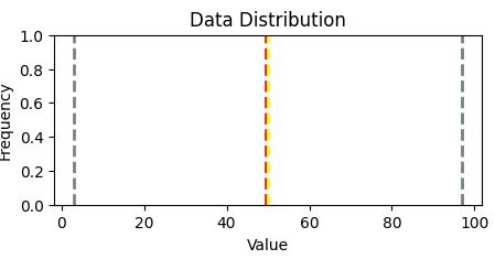
Two quartiles of the data reside: ~ 36 and 63, ie. 0-36 and 63-100
Grades are between 36 and 63.
As a summary: distribution and plot box in the same figure
Another way to visualize the distribution of a variable is to use a box plot (box-and-whiskers plot)
var = df_students['Grade']
fig = plt.figure(figsize=(5,2))
plt.boxplot(var)
plt.title('Data distribution')
fig.show()
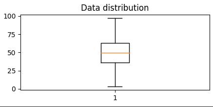
It is diferent from Histogram.
Show that
50% of dataresides - in 2 quartiles (between 36% abn 63%),
the other 50% of data are between 0 - 36% and 63% -10%
Most common approach to have at a glance all is to build Histogram and Boxplot in the same figure.
# Create a function show_distribution
def show_distribution(var_data):
from matplotlib import pyplot as plt
min_val = var_data.min()
max_val = var_data.max()
mean_val = var_data.mean()
med_val = var_data.median()
mod_val = var_data.mode()[0]
fig, ax = plt.subplots(2, 1, figsize = (5,3))
# Plot histogram
ax[0].hist(var_data)
ax[0].set_ylabel('Frequency')
#Draw vertical lines
ax[0].axvline(x=min_val, color = 'gray', linestyle='dashed', linewidth = 2)
ax[0].axvline(x=mean_val, color = 'cyan', linestyle='dashed', linewidth = 2)
ax[0].axvline(x=med_val, color = 'red', linestyle='dashed', linewidth = 2)
ax[0].axvline(x=mod_val, color = 'yellow', linestyle='dashed', linewidth = 2)
ax[0].axvline(x=max_val, color = 'gray', linestyle='dashed', linewidth = 2)
#Plot the boxplot
ax[1].boxplot(var_data, vert=False)
ax[1].set_xlabel('Value')
fig.suptitle('Data Distribution')
fig.show()
col = df_students['Grade']
#Call function
show_distribution(col)
Result:
Minimum:3.00
Mean:49.18
Median:49.50
Mode:50.00
Maximum:97.00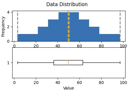 Central tendency
are right i
n the middle of the data distribution, which is symmetric with values becoming progressively lower in both directions from the middle
The
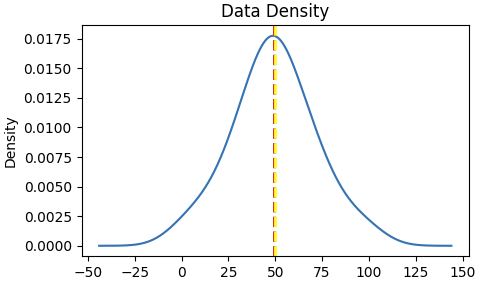
Probability Density Functionis well implemented in pyplot
# Make sure you have scipy.
# How to install
# pip install scipy (run this in CS Code terminal
def show_density(var_data):
from matplotlib import pyplot as plt
fig = plt.figure(figsize=(10,4))
# Plot density
var_data.plot.density()
# Add titles and labels
plt.title('Data Density')
# Show the mean, median, and mode
plt.axvline(x=var_data.mean(), color = 'cyan', linestyle='dashed', linewidth = 2)
plt.axvline(x=var_data.median(), color = 'red', linestyle='dashed', linewidth = 2)
plt.axvline(x=var_data.mode()[0], color = 'yellow', linestyle='dashed', linewidth = 2)
# Show the figure
plt.show()
# Get the density of Grade
col = df_students['Grade']
show_density(col)

The density shows the characteristic "bell curve" of what statisticians call a
normal distribution with the mean and mode at the center and symmetric tails.
References:
Exam DP-100: Designing and Implementing a Data Science Solution on Azure - Certifications | Microsoft LearnWelcome to Python.orgpandas - Python Data Analysis Library (pydata.org)Matplotlib — Visualization with Python0


 Looking to understand how values ae distributed, measure somehow to find the measure of central tendency (midle of distributin / data)

 Central tendencyare right in the middle of the data distribution, which is symmetric with values becoming progressively lower in both directions from the middle